
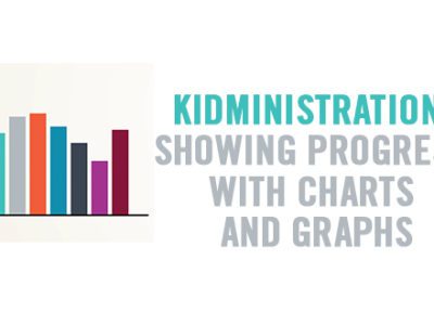
 Business analysts call it Data Visualization, and it has become a huge part of tracking and analyzing performance in relation to reaching business objectives in the corporate world. The science of presenting information in a way that can be displayed in images has become an artform, and big companies are shelling out big money to integrate it into their workflows. What the corporate community calls Data Visualization, ordinary people might call charts, graphs, and pictures; and they can be an incredibly effective tool for communicating ministry results in a way that can be quickly processed and easily understood.Presenting your ministry results using charts, graphs, and images draws focus to the results and engages people who might otherwise not pay much attention to the information.
Let’s say you’d like to report the results of a recent food drive. You could write a sentence that says, “Our kids had a goal of collecting 300 cans of food to donate to our local food pantry. They actually collected 347.” This certainly gets the information across, but that sentence could easily get lost on a page with lots of other words, and it may not be very memorable. Consider instead presenting that same information using a simple bar chart.

This lets people see quickly that the kids exceeded their goal, and visually communicates their success. Simple charts like this can be used to report giving, attendance, and decisions made. Whenever you can set a goal, consider creating a chart to track your progress and report the results. Whether you create a thermometer type chart on a poster board and color it in as you go, or use a simple spreadsheet tool, looking at a chart that identifies a target goal and watching results come in from the beginning of a campaign makes achieving goals fun for your kids, their families, your co-leaders, and your church staff. Don’t be afraid to get creative. You can make your scorecard more kid-friendly by using clipart to color in your bar charts.

Pie charts are an excellent way to report segmented information. Viewing your weekly attendance in the form of a pie chart can help you see the relative size of each service time. This does more than merely report total attendance, it provides insight into the attendance practices of families with children and gives you perspective in regard to your facility and volunteer needs for each program hour.

The CentriKid camp team at Lifeway Kids makes an annual practice of reporting ministry results using fun visuals that draw leaders into the numbers in a creative and memorable way. The way CentriKid presents its results captures the personality of our camp ministry, and adds to the sense that these results are not boring numerical statistics, but that our camp results are something exciting and worthy of celebration. By the way, if you haven’t been to CentriKid, you really need to check it out! The results speak for themselves.

Whether you choose to use a simple bar graph, a pie chart, or a colorful and artsy illustrated poster to present information about your ministry, you should absolutely look for ways to communicate data in a visual way. Doing so will engage the hearts minds and memories of your pastors, parents, and ministry partners and raise their awareness of what God is doing in your area. They will also make you look like a kids ministry genius.
Chuck Peters is Director of Operations for Lifeway Kids. A graduate of Columbia Bible College, Chuck has served vocationally & voluntarily in Student and Children’s Ministry for many years.
 Getting the Most Out of Your Camp Experience
 »
»
Leave a Reply